Matplotlib 从入门到入土
Matplotlib
什么是 Matplotlib
- 专门用来开发 2D 图表(包括 3D 图表)
- 使用起来极其简单
- 以渐进、交互式方法实现数据可视化
为什么要学习 Matplotlib
可视化是在整个数据挖掘的关键辅助工具,可以清晰的理解数据,从而调整分析方法
- 能将数据进行可视化,更直观的呈现
- 使数据更加客观、更具说服力
快速上手
实现一个简单的画图
1 | |
Matplotlib 三层结构
容器层
容器层主要由 Canvas,Figure,Axes组成
Canvas位于最底层的系统层,在绘图过程中充当画板的角色,即放置画布(Figure)的工具
Figure是Canvas上方的第一层,也是需要用户来操作的应用层的第一层,在绘图过程中充当画布的角色 Axes是应用层的第二层,在绘图过程中相当于画布上的绘图区的角色
- Figure:指整个图形(可通过plt.figure()来设置画布大小和分辨率)
- Axes(坐标系):数据的绘图区域
- Axis(坐标轴):坐标系中的一条轴,包含大小限制、刻度和刻度标签
特点为:
- 一个Figure可以包含多个Axes,但一个Axes只能属于一个Figure
- 一个Axes可以包含多个Axis,包含2个为2D坐标系,包含3个为3D坐标系
辅助显示层
辅助显示层为Axes内除了根据数据绘制出的图像以外的内容,主要包括Axes外观(facecolor)、边线框(spines)、坐标轴(axis)、坐标轴名称(axis label)、坐标轴刻度(tick)、坐标轴刻度标签(tick label)、网格线(grid)、图例(legend)、标题(title)等内容
该层的设置可使图像显示更加直观和容易被理解,但不会对图像产生实质性影响
图像层
图像层指Axes内通过plot、scatter、bar、histogram、pie等函数根据数据绘制出的图像
每一个绘图区都可以有不同的图表(散点图、折线图、柱状图等)
折线图
折线图的绘制与保存图片
假如我们要展现一周温度变化,我们可以用下面这串代码来实现
1
2
3
4
5
import matplotlib.pyplot as plt
plt.figure()
plt.plot([1, 2, 3, 4, 5, 6, 7], [17, 18, 19, 7, 4, 21, 28])
plt.show()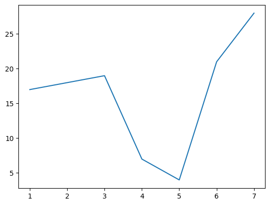
我们可以进一步设置画布属性,以及图片保存
1
2
3
4
5plt.figure(figsize= (), dpi= )
# figsize 指定图的长宽
# dpi 分辨率
plt.savefig(path)
# 保存图片,要写在 plt.show() 之前进一步的,从辅助显示层中增加信息
1
2
3
4
5
6
7
8
9
10
11import random
x = range(60)
y = [random.uniform(15, 18) for i in x]
plt.Figure(figsize= (12, 8), dpi= 500)
plt.plot(x, y)
x_label = ["11点{}分".format(i) for i in x]
# 修改 x,y 轴
# 若出现中文无法正常输出,尝试 plt.rcParams['font.family'] = 'Microsoft YaHei'
plt.xticks(x[ : : 10], x_label[ : : 10])
plt.yticks(range(0, 41)[::5])
plt.show()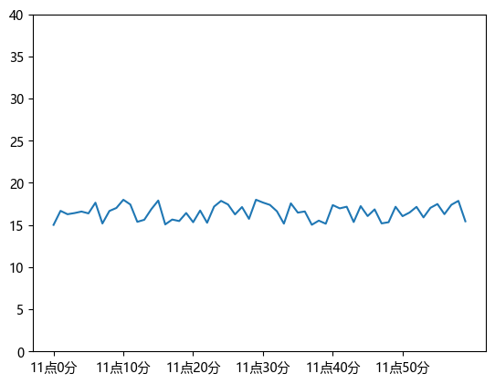
添加网格
1
2plt.grid(True, linestyle= '--', alpha= 0.5)
# alpha 是透明度添加描述信息
1
2
3plt.title("温度随时间变化图")
plt.xlabel("时间")
plt.ylabel("温度")再添加一条曲线
1
2
3
4
5
6
7
8
9
10
11
12
13
14
15
16
17
18
19
20
21import random
x = range(60)
y = [random.uniform(15, 18) for i in x]
y2 = [random.uniform(5, 10) for i in x]
plt.Figure(figsize= (12, 8), dpi= 500)
plt.plot(x, y, color= 'r', linestyle= '--') # 可进一步修改
plt.plot(x, y2) # 增加一条曲线
x_label = ["11点{}分".format(i) for i in x]
plt.xticks(x[ : : 10], x_label[ : : 10])
plt.yticks(range(0, 41)[::5])
plt.grid(True, linestyle= '--', alpha= 0.5)
plt.title("温度随时间变化图")
plt.xlabel("时间")
plt.ylabel("温度")
plt.show()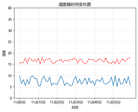
添加图例
1
2
3
4# 在上述代码中修改和添加
plt.plot(x, y, color= 'r', linestyle= '--', label= "curve1")
plt.plot(x, y2, label= "curve2")
plt.legend()多个坐标系显示
1
2
3
4
5
6
7
8
9
10
11
12
13
14
15
16
17
18
19
20
21
22
23
24
25
26# subplots(nrows= 1, ncols= 1, **fig_kw)
# nrows 行的数量 ncols 列的数量 fig_kw 子图的大小(可空)
figure, axes = plt.subplots(nrows= 1, ncols= 2, figsize= (20, 8), dpi= 80)
axes[0].plot(x, y, label= "curve1")
axes[1].plot(x, y2, label= "curve2")
axes[0].legend()
axes[1].legend()
axes[0].set_xticks(x[: : 10], x_label[: : 10])
axes[0].set_yticks(range(0, 41, 5))
axes[1].set_xticks(x[: : 10], x_label[: : 10])
axes[1].set_yticks(range(0, 41, 5))
axes[0].grid(linestyle= '--', alpha= 0.5)
axes[1].grid(linestyle= '--', alpha= 0.5)
axes[0].set_title("温度随时间变化图")
axes[0].set_xlabel("时间")
axes[0].set_ylabel("温度")
axes[1].set_title("温度随时间变化图")
axes[1].set_xlabel("时间")
axes[1].set_ylabel("温度")
plt.show()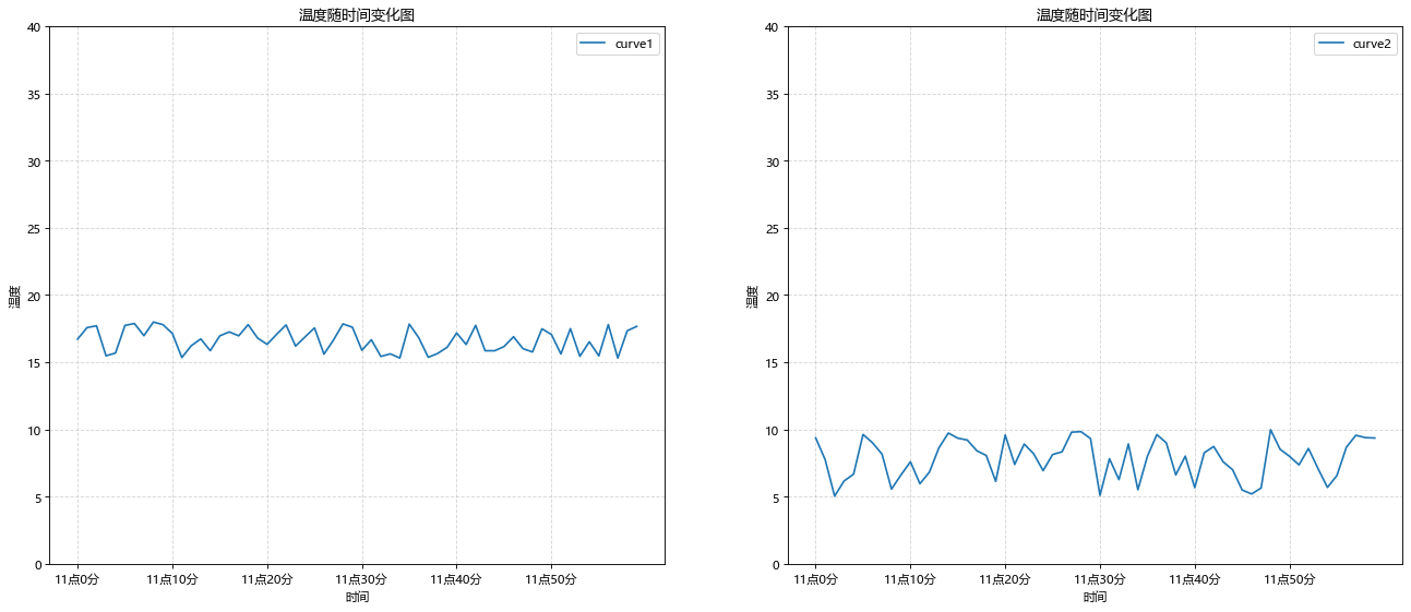
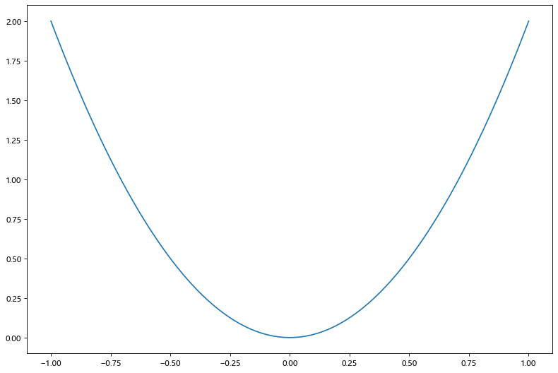
绘制数学函数图像
1 | |
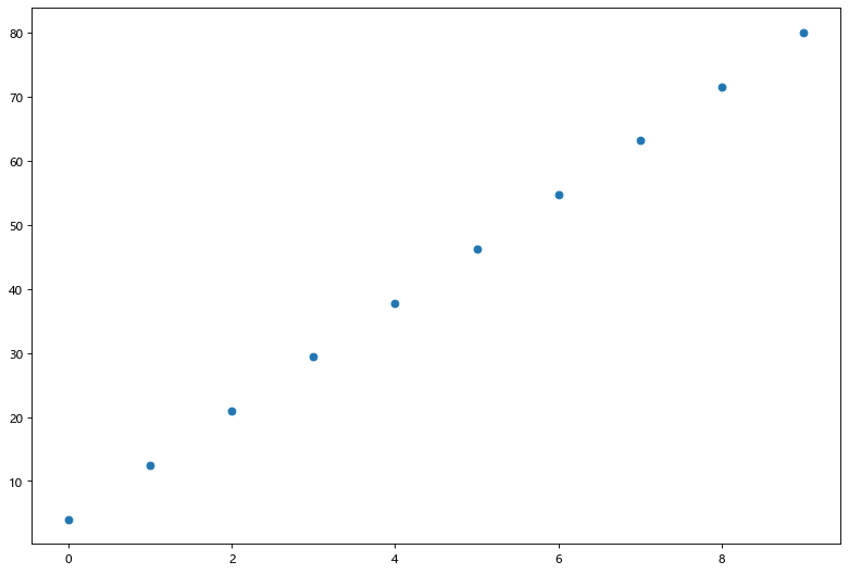
散点图
1 | |
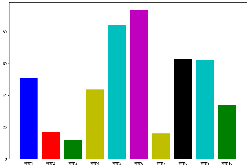
柱状图
1 | |
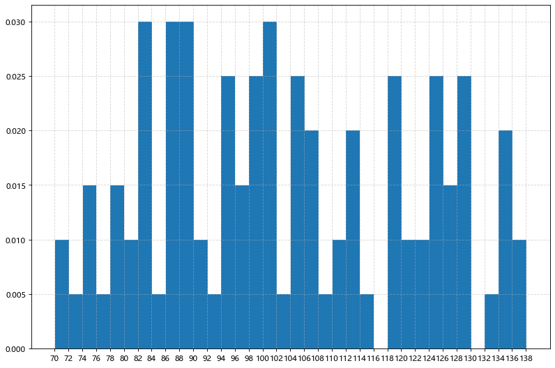
直方图
1 | |
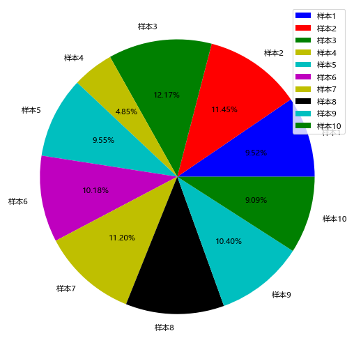
饼图
1 | |
Matplotlib 从入门到入土
http://example.com/2025/11/22/Matplotlib/